Sabé tapped oneteam™ to refresh its master brand identity and packaging for their 750ml spirits, while also developing an all-new package for their innovative ready-to-drink line. Our challenge: visually capture Sabé’s East-meets-West cocktail culture with a clean, elevated system that could flex across formats. We modernized the brandmark, introduced a sleek bottle and label system, and brought flavor-forward differentiation to the RTD lineup through a muted, premium color palette. The result is a unified, standout brand experience—designed to intrigue, connect, and perform at shelf across every channel.
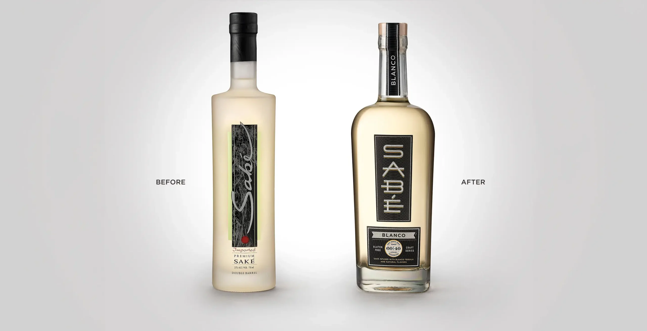
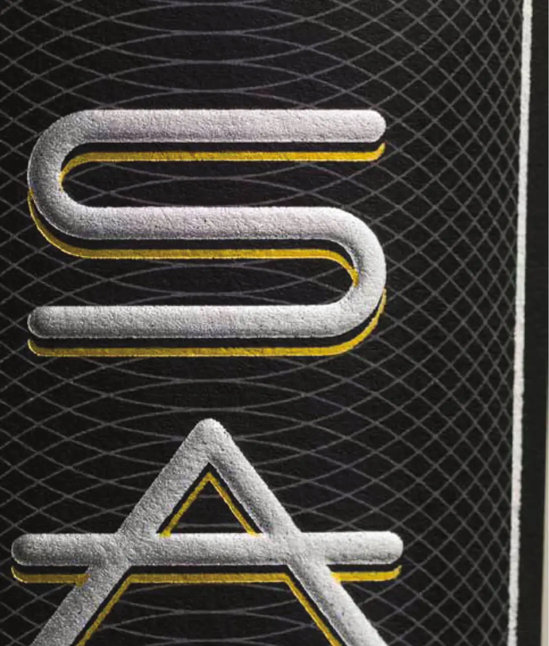
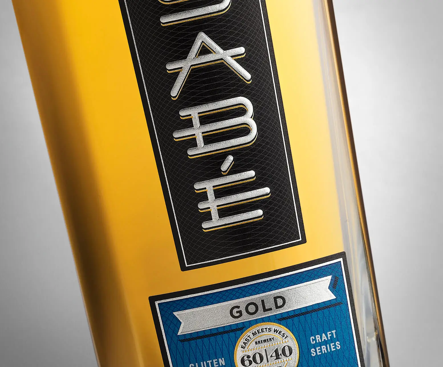
Our refreshed Sabé wordmark keeps the original’s vertical spirit but improves clarity by stacking letters top to bottom. A custom sans serif font nods to sake’s Eastern roots through symbolic simplicity—resulting in a mark that feels both modern and premium on shelf.
Blending design cues from sake, tequila, and vodka, we crafted a one-of-a-kind packaging system—complete with bold typography, luxe finishes, and a custom bottle structure—that stops shoppers in their tracks and positions Sabé as a premium player in a category all its own.
For the RTDs, we crafted a clean, contemporary look using layered textures and a muted-yet-appetizing color palette—elevating flavor cues, building brand clarity, and creating standout shelf presence for every cocktail in the lineup.