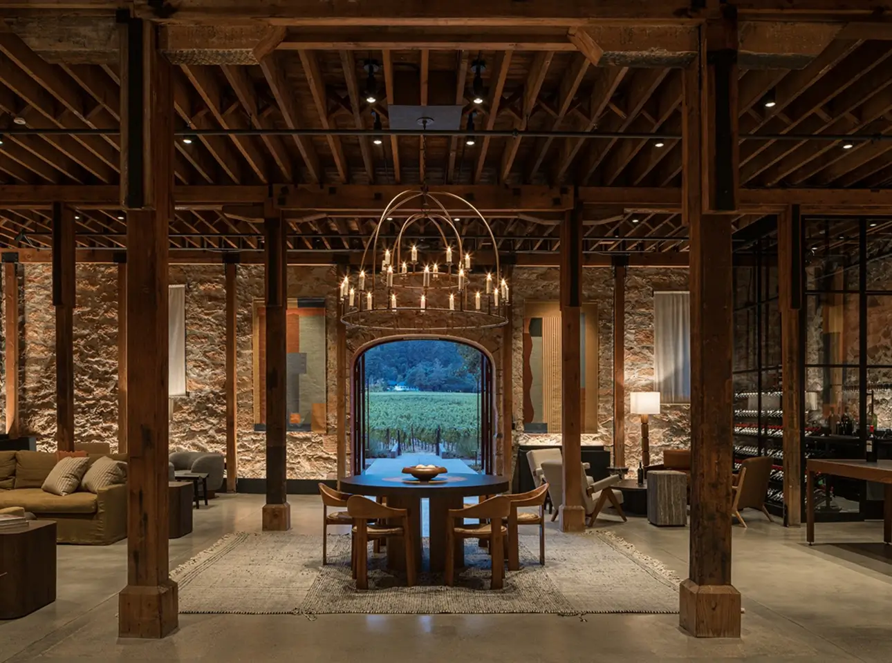
Chateau St. Jean had the prestige, but a fragmented brand presence across retail, digital, and internal channels was quietly undermining it. Inconsistent visuals and tone were eroding the premium positioning the wine deserved. oneteam™ built a comprehensive visual identity system from the ground up, establishing a unified design language across color, copywriting, photography, typography, and tone, then pressure-tested it across packaging direction, website wireframes, and presentation templates. The result: one clear, confident brand voice, everywhere it shows up.

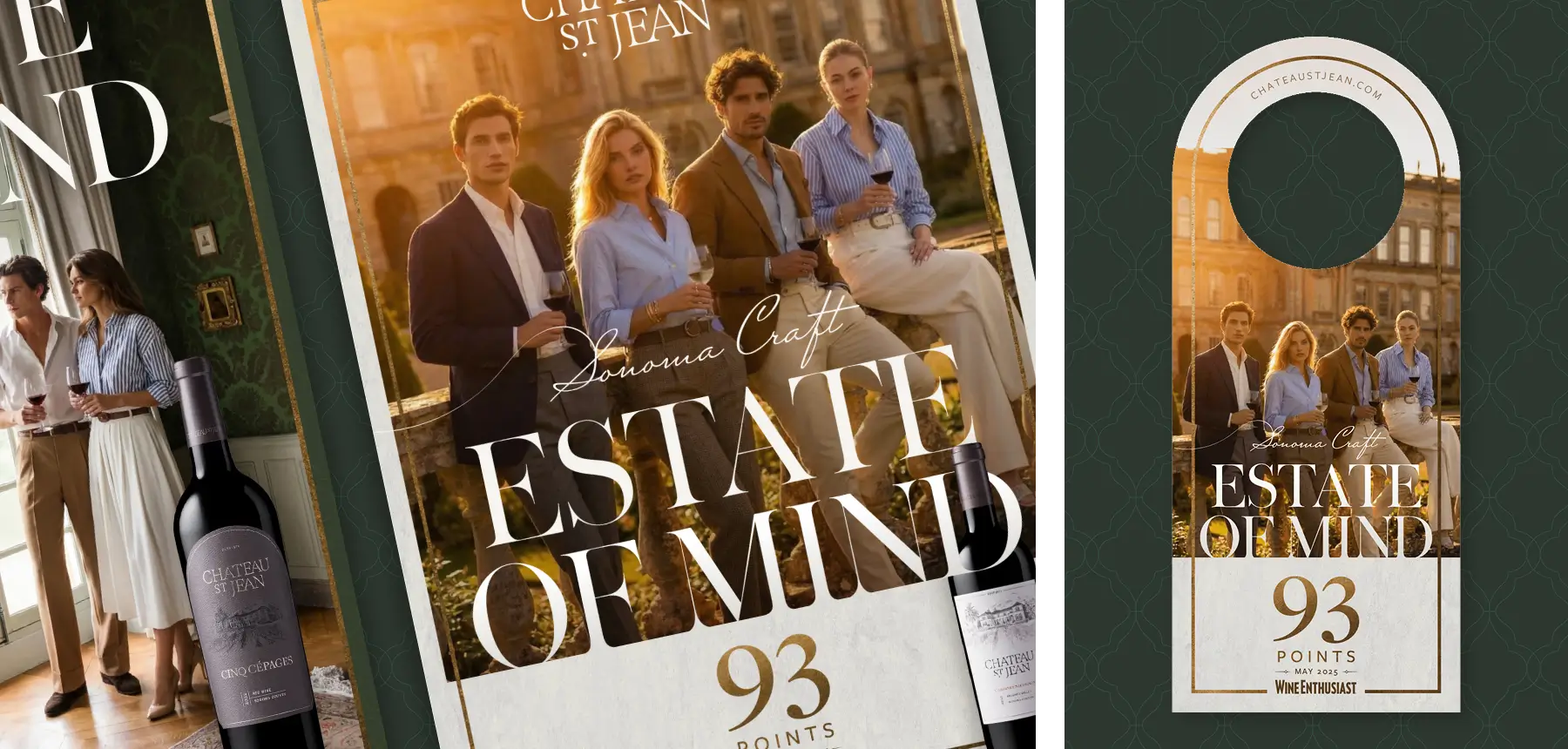
To ground Chateau St. Jean’s identity in something cohesive and ownable, oneteam™ conducted a thorough audit of the brand’s existing touchpoints, identifying the visual and tonal gaps eroding its premium positioning. From that foundation, the team developed a comprehensive plan, establishing clear standards for color, typography, and tone that would govern every channel, from retail shelf to digital screen.

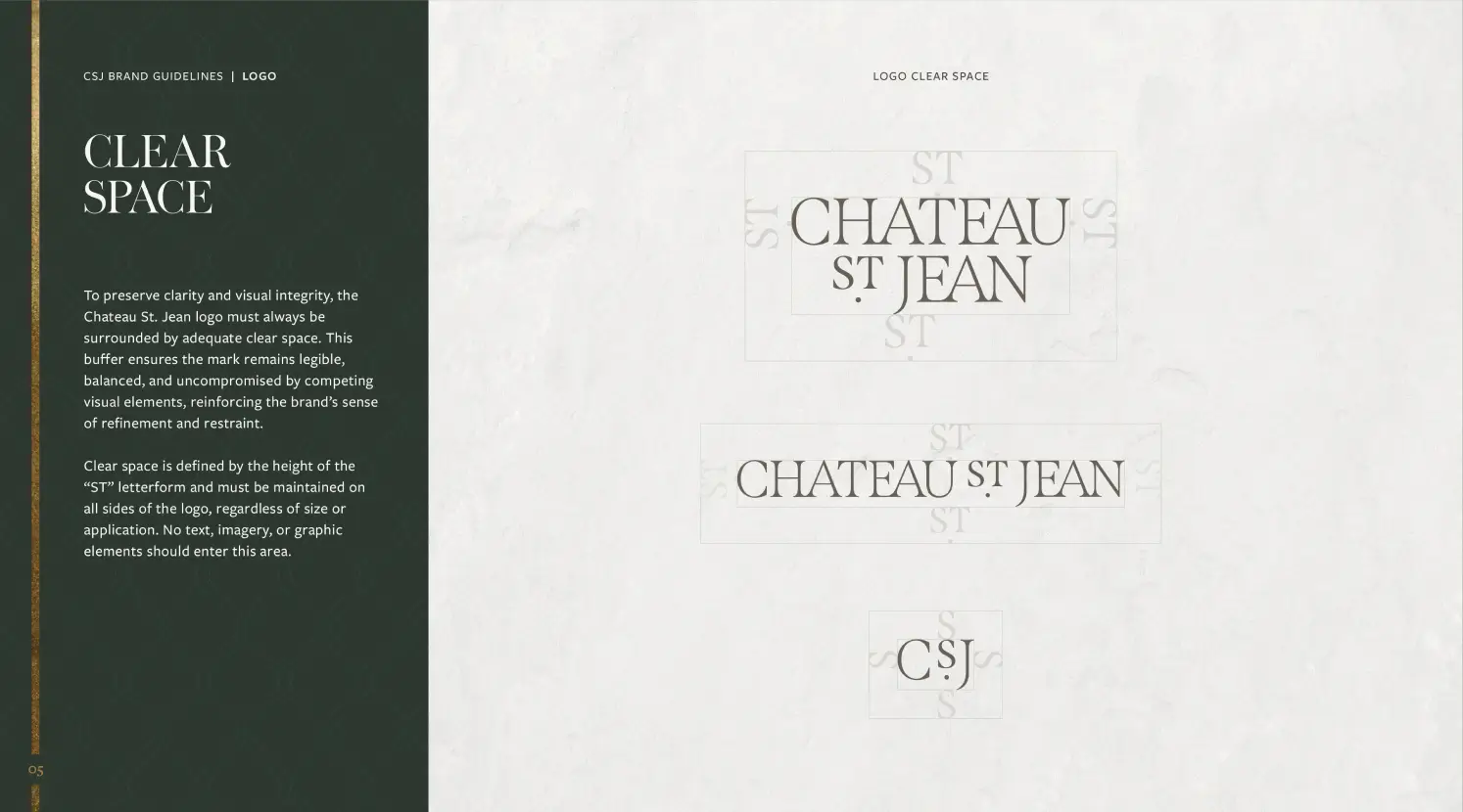
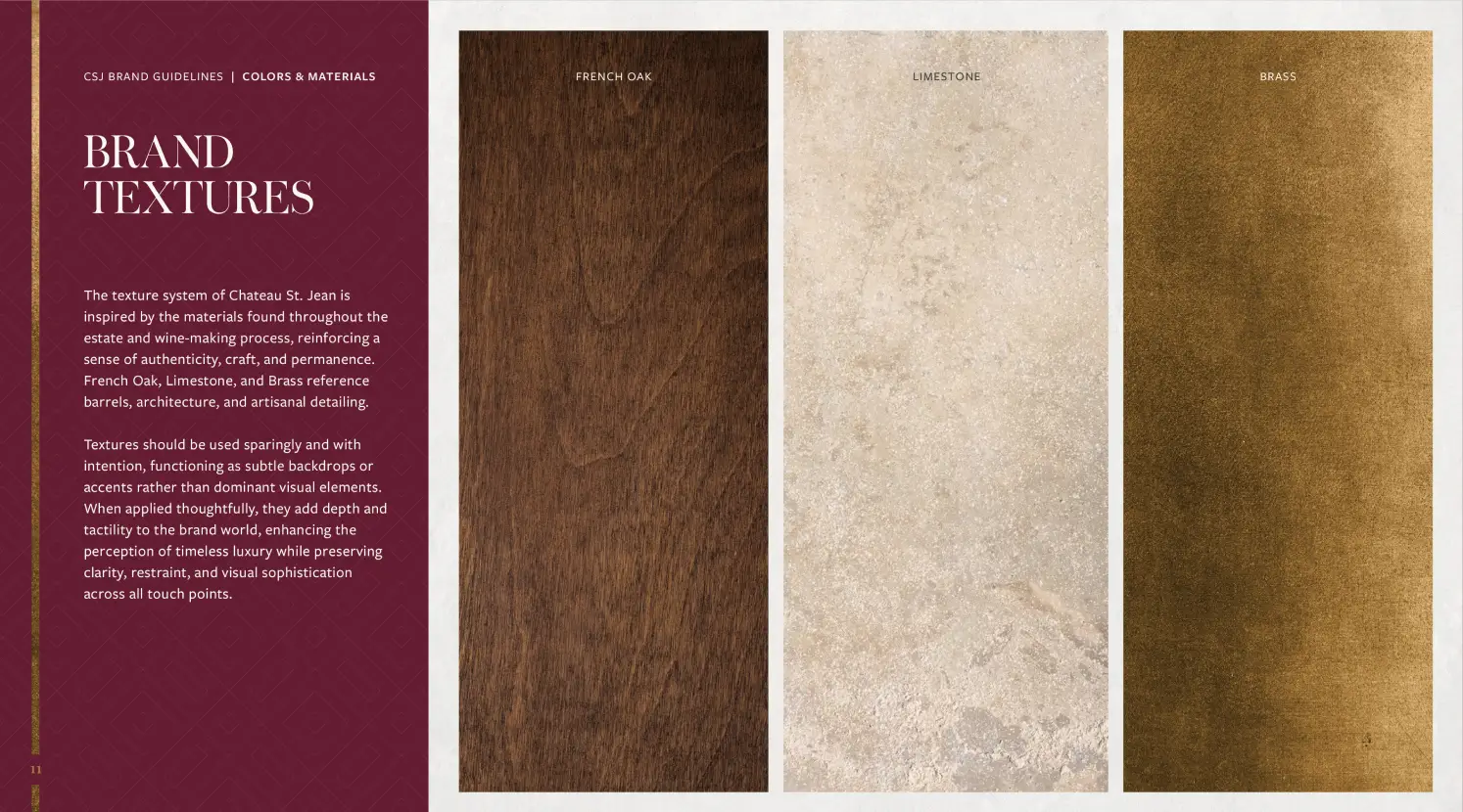
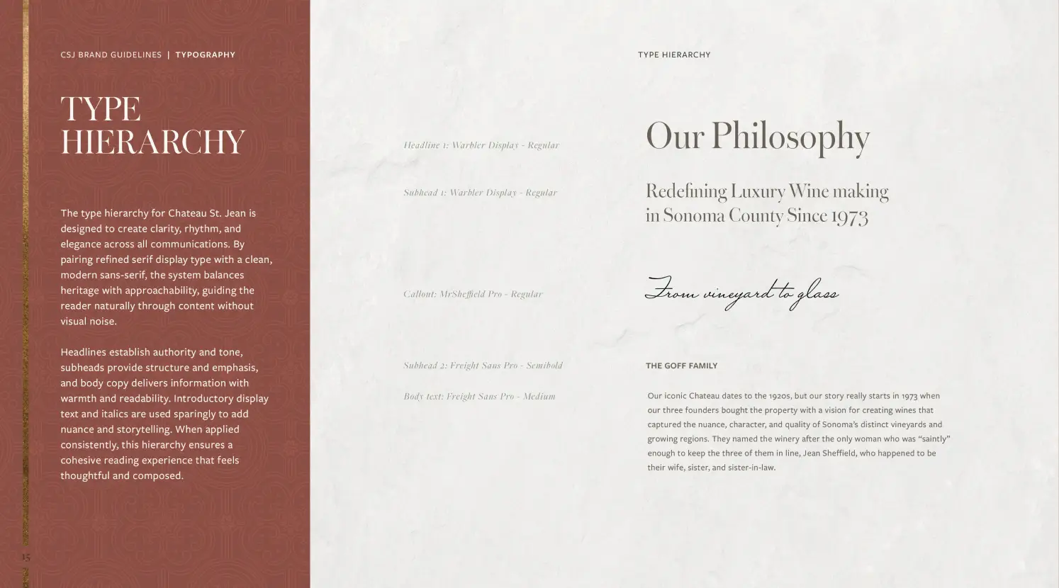
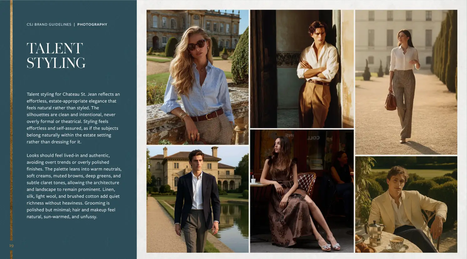
To unify Chateau St. Jean’s brand across every channel, oneteam™ developed a comprehensive visual identity system covering color and materials, typography, point-of-sale applications, and photography direction. The resulting guidelines gave internal teams and external partners a single, authoritative framework, eliminating the inconsistencies and sticking points.
"[oneteam] didn't just deliver beautiful creative; they gave us a complete system to build from. We walked away with the tools, guidance, and confidence to bring the brand to life consistently across everything we do!"