RISE Brewing Co. was stepping into a more competitive retail landscape with new packaging, expanding distribution, and a positioning built around the everyday coffee ritual. The opportunity was clear: translate that positioning into a shelf presence that cuts through the noise, communicates instantly, and earns its place in a crowded category. oneteam™ grounded every creative decision in real shelf conditions, evaluating the competitive set in-store to find the whitespace worth owning. From shopper creative exploration to a fully scaled POS system, the work delivers a cohesive, premium expression that holds together everywhere RISE shows up. One brand idea, one consistent system, zero guesswork at shelf.

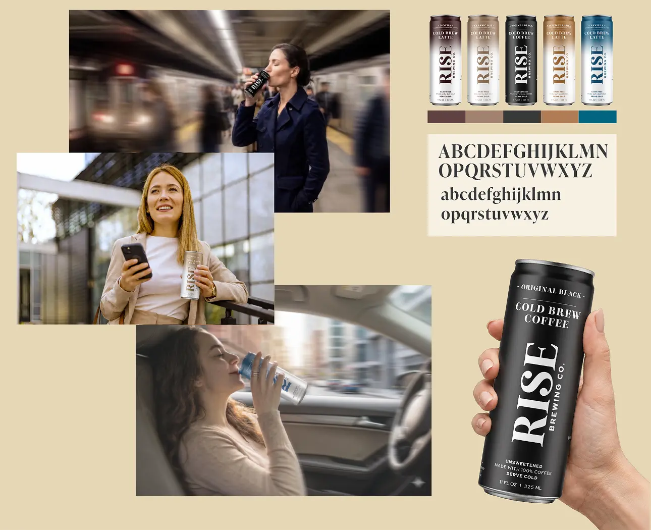
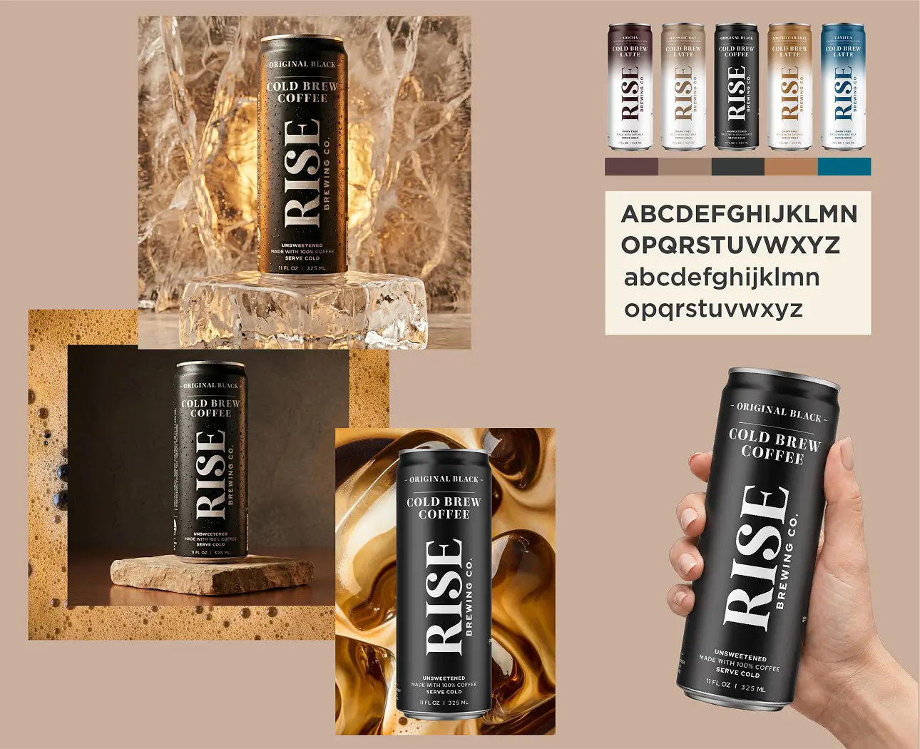
Before a single concept was explored, oneteam™ evaluated the competitive set in-store to identify visual patterns, whitespace, and opportunities for disruption. Those findings shaped three distinct creative territories, each translating RISE’s “Coffee Worth Slowing Down For” positioning into a shopper-facing expression built to stand apart in a crowded coffee set.
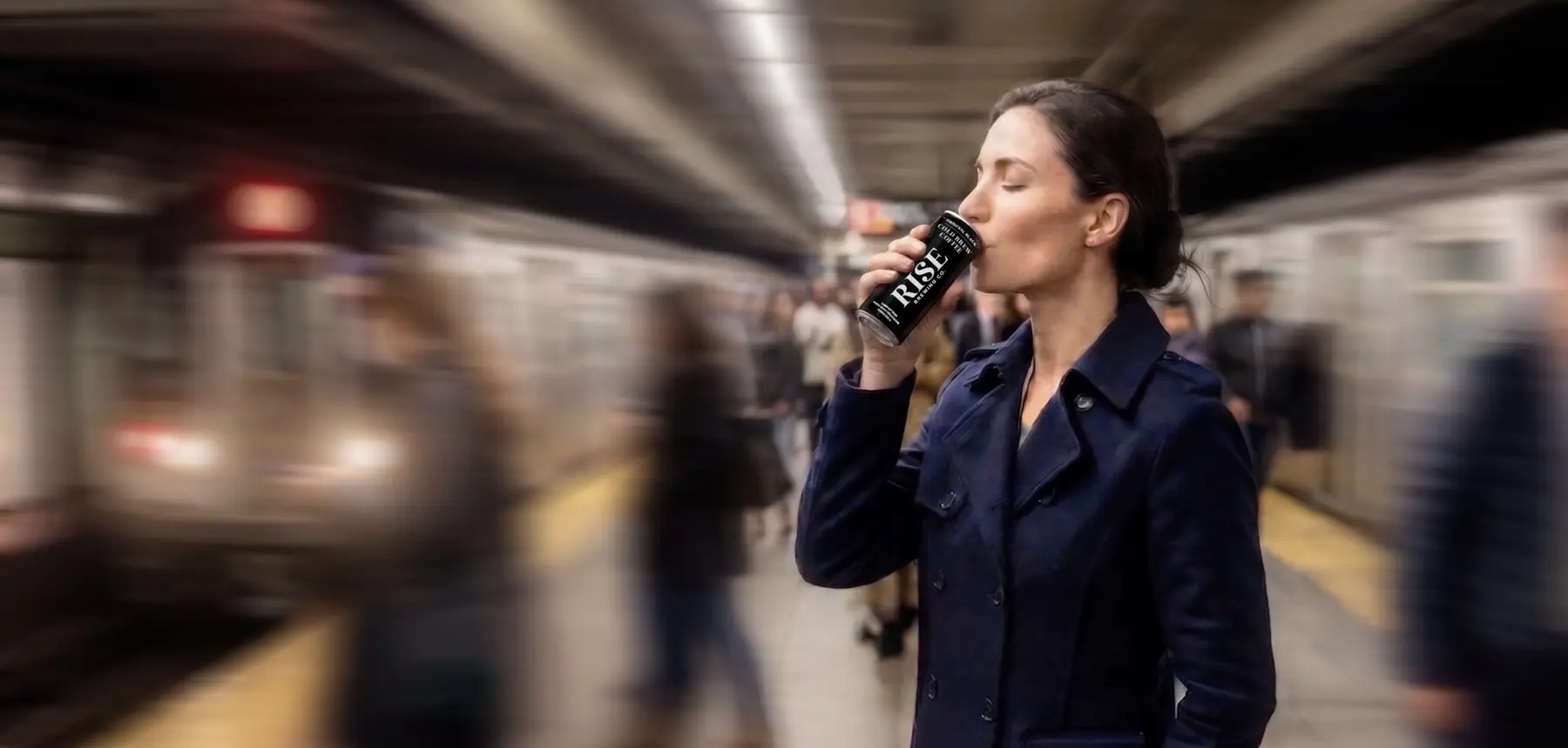
RISE’s positioning was translated into a shelf-ready key visual rooted in real, on-the-go moments. Natural photography, motion blur, and graphic overlays capture the energy of everyday urban life, treating movement as a design asset while positioning RISE as the one constant in a fast-moving world.
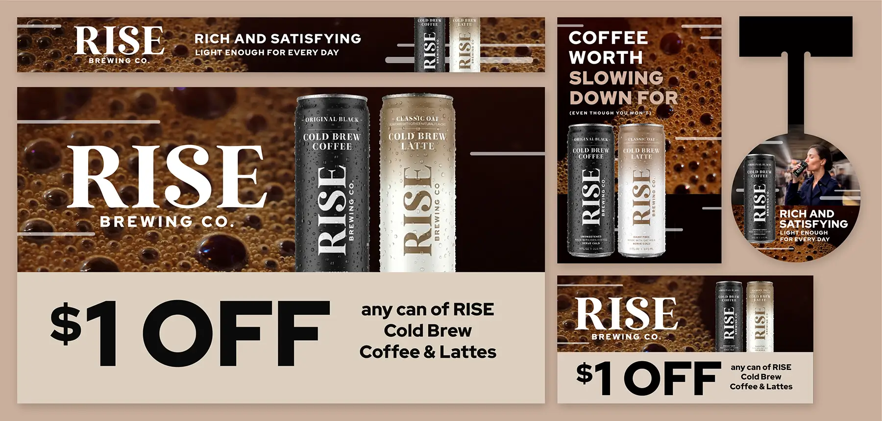
The approved key visual was extended into a full POS system across shippers, shelf strips, wobblers, static clings, and coupon formats. Each asset was designed around its specific retail function, balancing visibility and disruption with a consistent messaging hierarchy to give RISE a cohesive, premium presence at shelf.

A beloved creative territory that was not selected for retail was given new life across RISE’s digital experience. The direction was adapted into a suite of product detail images and website banners centered on the liquid in the can, highlighting the richness and drinkability of each SKU from shelf to screen.